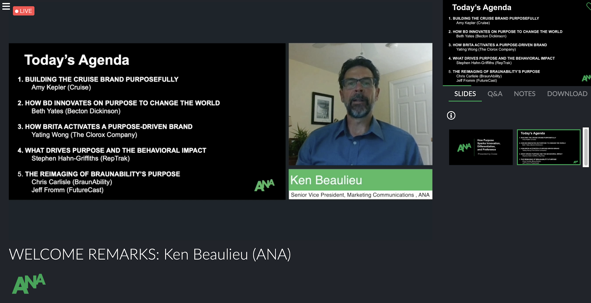
2020 Adobe MAX Conference | Shadiq Williams
Session: “Smarter Social Storytelling | Gary Vee Interview” | linkedin.com/in/garyvaynerchuk/
Notable Quote: “Stay Agile: be ready to pivot … Be Human: focus on being empathetic … Serve: be of service to others … Play more: experiment; explore; worst thing to do is to not try new things”
Gary is already so well known for this expertise in media strategy and his raw, unfiltered delivery, but this particular interview gave me a much stronger understanding of how he thinks and why his mind is so valuable. One of the most noteworthy things that Gary shed light on is how he is able to land on his insights that often feel near psychic. He explained that his main strategy is to study cycles of human habits in order to predict what should be expected in the future. The example that he gave was in response to why he so heavily advocates for collecting baseball cards. Gary’s explanation is that if you look into the generation that collected baseball cards, you will notice that they are now becoming grandparents and grandparents like to “pass down” things to their children and grandchildren which is why baseball cards are so valuable now. This relatively simple idea makes so much sense and gave me a new perspective on how to generate insights. Humans are still “creatures of habit”, so there is definitely room for finding insights that are timeless and not necessarily “at this moment” which was how I originally thought about insights.
Session: “Good Design is Good Business” | LinkedIn: **Sagi Haviv isn’t on LinkedIn**
Notable Quote: “Art gives you the understanding that you are capable of your full capacity”
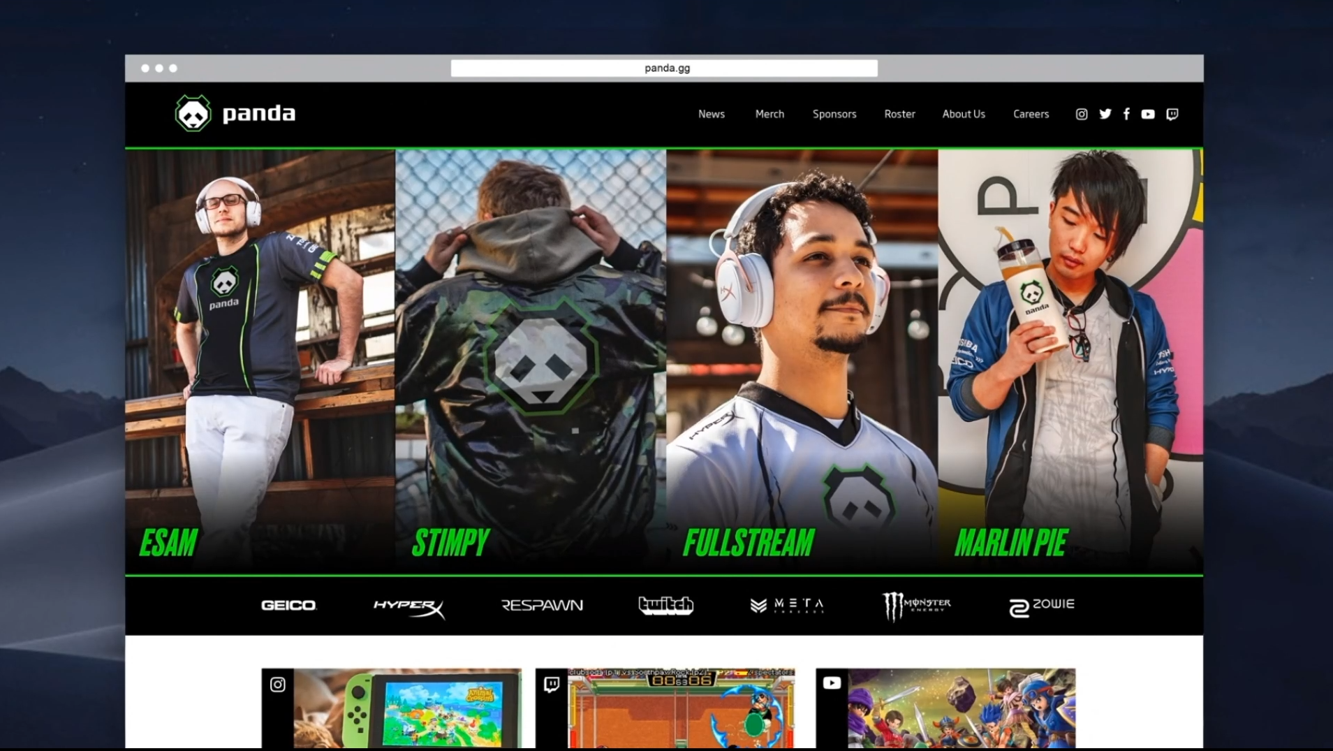
I really appreciated this session a lot because we got a direct glimpse into the creative process for logos such as Animal Planet, Panda Global, and NBC. As a graphic designer myself, I often struggle figuring out how to help clients see their logo as a business solution and not just a visually appealing image. Hearing Sagi Haviv show the different logo concepts-in-progress for several huge brands gave me insight to how world class designers aim to communicate the most with the least.
The most interesting part of the session was how Sagi Haviv described each of the 3 criteria (appropriate, distinctive, and simple) as existing on their own “scale” and how it is not about being at the farthest end of the spectrum on each scale. Rather, it is about finding the right place to be within each individual scale in order to compliment the other criteria and create a “good logo.” The example that I gravitated towards the most was the “Panda Global” redesign. He explained how the goal was for the new logo to remain appropriate for the brand (incorporating a panda) while still being distinct from other brands that use panda symbolism. In this case, the far left end of the spectrum would be “Literal/Pictorial” for optimal recognition vs “Symbolic/Abstract” on the far right for maximum ownability (unique to the brand itself).
A recurring theme with all of the logo breakdowns was the reduction of each original design to the most distinguishable yet unique elements. This approach was applied in the Panda Global rebrand by “creating a geometric translation of just the face of the panda.” This was helpful for the brand because the agency realized that “[panda gaming’s] world really requires the mark to work very very small” and the new design allowed the logo to be resized without losing its personality. This is important because it reminded me that a logo is not “good” if it is not functional. The three criteria that were outlined gave me language to help clearly and efficiently describe to clients what “functional” means from the perspective of a designer and in the best interest of the brand.
Session: “Smarter Social Storytelling | Meme Warfare: Design in the Age of Disinformation”
Dan Stiles linkedin.com/in/danstiles/
Notable Quote: “[Meme definition] an element of a culture or system of behavior that may be considered to be passed from one individual to another by non genetic means, especially imitation.“
This specific segment of the session was by far my favorite experience from the whole conference. I was admittedly caught off guard and confused by the title, but Dan completely blew my mind. The topic of the presentation was about the different kinds of propaganda and how memes have evolved over time into its own form of propaganda. One of the many points made that were the most memorable was how memes spread propaganda by reinforcing a sense of “us vs them” within people. Memes can often employ traditional propaganda tactics in order to mock and dehumanize people on other ends of the political spectrum. Also in sharing memes, misinformation can circulate and one of the only reasons why they gain so much traction is because they speak to and reinforce the biases that we may already have. As a result, misinformation starts becoming more and more believable and thus more shareable because it instils a sense of, “well so many people would not be saying it if it was not true.” While not a direct quote from Dan, that is the general sentiment described by Dan.
The moment that this really started making the most sense to me was in class when Natalie spoke about her goal to shift the public perception of the Bronx as a native herself. I took a moment to ask myself, “Why are people speaking so poorly about the Bronx in the first place?” and I landed on a potential explanation. I realized that the sentiments and attitudes towards the Bronx that I see shared by New Yorkers from other boroughs are circulated through memes. Admittedly, I then realized my participation in what initially feels like harmless banter is what allows more harmful stigmas of the Bronx to be perpetuated and then ingrained as people’s actual perception of the borough and its residents. Ever since this session, I have been even more vigilant about the memes that I share and the potential long term effects on the minds of people consuming and sharing the imagery.
Overall, this conference reassured something that I have started to intuitively pick up on since starting my YouTube channel and progressing through my first semester at BIC: There are “gaps” in the business of design created by lack of technical expertise, but what truly distinguishes the highest tier of creatives from the rest is how they think. What makes our minds so powerful is that a creative person can become the most invaluable person in the room solely with the most intangible thing about them.
All of the presenters were world-class within their disciplines, but what made them qualified to speak to the whole world is the way that they have trained their minds. From my perspective, they have reached a level where they can constantly think outside of the box, be ahead of the curve, and be at the forefront of technical and intellectual innovation. Even if facilitating a technical workshop, what is created using the software is still dependent on what a person can do with their mind and that is not something that can be taught.
While it is more sentimental than anything else, my biggest takeaway from Adobe MAX was the affirmation that I am on the right path in my life along with my intellectual growth and professional development. I have been frustrated with what I perceive to be a lack of technical “skill” when I compare myself to other graphic designers who I know that I can think and analyze circles around. I now feel like as long as I continue to refine how I approach thinking and problem solving, my technical skills can be improved along the way and the quality of my work throughout that improvement will be exponentially better over time.


